My favorite CSS hacks
As it is with every coding language, there are several shortcuts or hacks with CSS that allow you to write cleaner code, improve design elements, and save valuable time. Furthermore, you can directly insert these snippets to your site using a code editor. And here is my favorite CSS Hacks.
Inherit box sizing # Anchor link
The border-box tells the browser to account for any border and padding in the values you specify for an element’s width and height.
html {
	box-sizing: border-box;
}
*, *:before, *:after {
	box-sizing: inherit;
}Selection pseudo class # Anchor link
Use selection pseudo-class to give a personal touch to text selection on your websites.
See the Pen Selection pseudo class by Alex Zappa (@reatlat) on CodePen.
Input Caret Color # Anchor link
Set the color of the cursor in input elements.
input, textarea {
	caret-color: #ff0000;
}
See the Pen Selection pseudo class by Alex Zappa (@reatlat) on CodePen.
No value, No problem # Anchor link
Display links when the element has no text value, but the attribute has a link.
a[href^="http"]:empty::before {
    content: attr(href);
}
See the Pen Selection pseudo class by Alex Zappa (@reatlat) on CodePen.
Fit images to the content # Anchor link
In this simple hack, you can make sure that your images always fit the visitor’s screen, regardless of the device they’re using. More use cases could be found here.
img {
    max-width: 100%;
    height: auto;
}
Detect dark system mode # Anchor link
When you want a style that applies to users with dark mode turned on, add your style inside media query below. If we want the black background and white text for dark mode users, we will type something like this:
@media (prefers-color-scheme: dark) {
    body {
        background-color: #111111;
        color: #FFFFFF;
    }
}
Hide images on mobile # Anchor link
Sometimes we have icons or images that we just don’t want to be seen on the mobile view.
@media only on screen and (max-width: 767px) {
	section .user-img {
		display: none;
	}
}
CSS vendor prefixes by browsers # Anchor link
CSS vendor prefixes, also sometimes known as or CSS browser prefixes, are a way for browser makers to add support for new CSS features before those features are fully supported in all browsers. This may be done during a sort of testing and experimentation period where the browser manufacturer is determining exactly how these new CSS features will be implemented.
The CSS browser prefixes that you can use (each of which is specific to a different browser) are:
- Android:
-webkit- - Chrome:
-webkit- - Safari:
-webkit- - iOS:
-webkit- - Firefox:
-moz- - Internet Explorer:
-ms- - Opera:
-o-
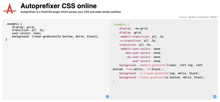
Autoprefixer # Anchor link
The Autoprefixer uses data on the popularity of browsers and support for vendor prefixes by browsers. Based on this information, it arranges and deletes the prefixes. It can help you get prefixes for: animations, transition, transform, grid, flex, flexbox and others.
To make sure your CSS works well on the rest of browsers, always use Autoprefixer, here ho is it looks like:
Conclusion # Anchor link
There are countless tricks we can use with CSS3. Which is your favorite? Comment down below.
May the 4th be with you,
Alex